

I love this season when all the color-of-the-year drops start making their way into the zeitgeist. Fashion makes its guess, paint brands release their mood boards, designers debate. Commentary on where we are, and where we think we’re headed. It’s one of my favorite annual tells.
So when someone asked what I thought of Pantone’s 2026 pick, I was ready for something new. A risk. A signal. A clue.
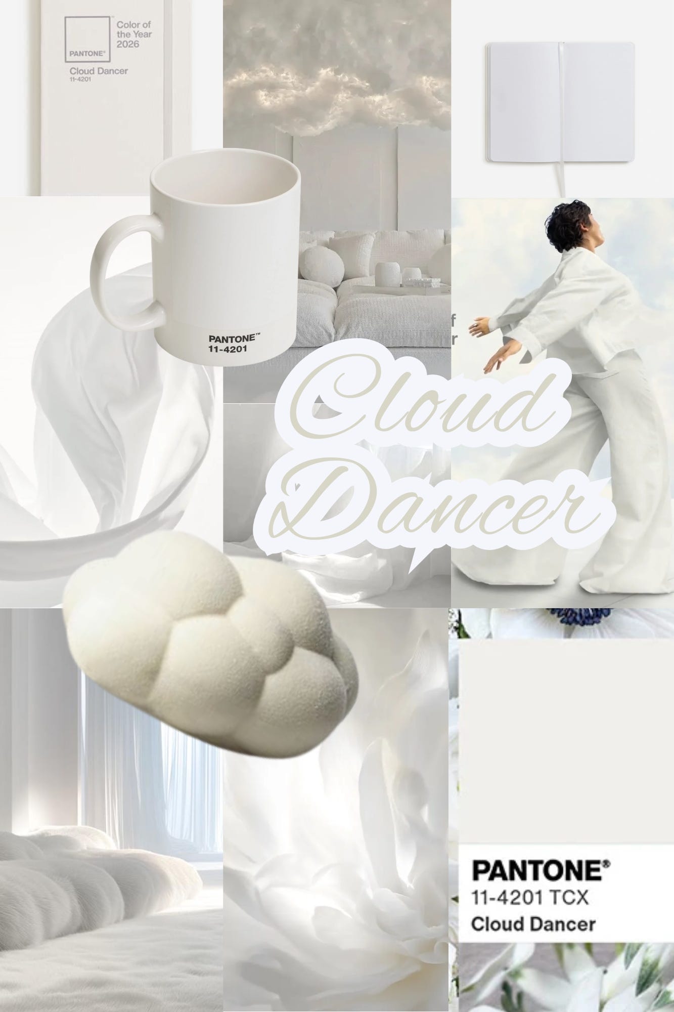
Instead… Cloud Dancer (11-4201).
I had a lot of thoughts…
“A whisper of tranquility and peace in a noisy world,” according to Pantone.
Let’s be honest. It’s white. Not off-white. Not “soft fog meadow dew.” White. Maybe a “billowy, balanced white” if you’re feeling generous, but still fundamentally the absence of color. The color you reach for when you don’t want to commit to a color at all.
And the creative community? Absolutely unamused. The comment section was brutal and honestly hysterical:
“Hope you’re ready for nothing.”
“Recession indicator.”
“I can’t wait to never use that.”
“Landlord special.”
“Mine is still loading…”
“Dystopian.”
“Pretentious.”
“It’s giving ‘I’ve got good jeans.’”
“Be better, Pantone.”
“Like a straight jacket.”
Was this safe? Or tone-deaf? Maybe both…
I get it. Choosing the absence of color as the color of the year feels… on the nose. For where we are right now: overstimulated, exhausted, cautious, and collectively bracing. Cloud Dancer feels a little “no sudden moves,” “don’t rock the boat.” Like one collectively held breath.
A few publications responded exactly how you’d expect:
Vanity Fair shrugged, “In the US, whiteness seems to be a safe bet.”
Better Homes & Gardens swooned as if this was a spiritual awakening: “Like a breath of fresh air.” Neither take interests me as much as the symbolism Pantone (possibly) unintentionally stumbled into.
But let’s zoom out—because there is something interesting happening here.
In Feng Shui, white is Metal. I read it as the end of the creative cycle. The refining phase. The edit. The moment when you stop adding and start subtracting. Metal is the mountaintop before you retreat into the cave again to dream up the next cycle, back into the Water…where the depth and imagination begin.
Pantone’s own statement echoes that exact energy:
“A conscious statement of simplification… enhancing focus… releasing distraction.”
That’s Metal.
And as we move toward the Age of Aquarius the old systems are not just shifting, they’re starting to crack. The ways that have been are not quite working as they should. We aren’t certain where to go next. We exist the blank space between eras. Maybe that’s what Cloud Dancer is…
So no, Cloud Dancer isn’t exciting. Not quite inspiring… But symbolically? It tracks.
We’re collectively refining. Stripping down to “Where are we actually headed?” before choosing what matters next.
Maybe Cloud Dancer isn’t a color to use—maybe it’s a mirror.
And maybe that’s the point.
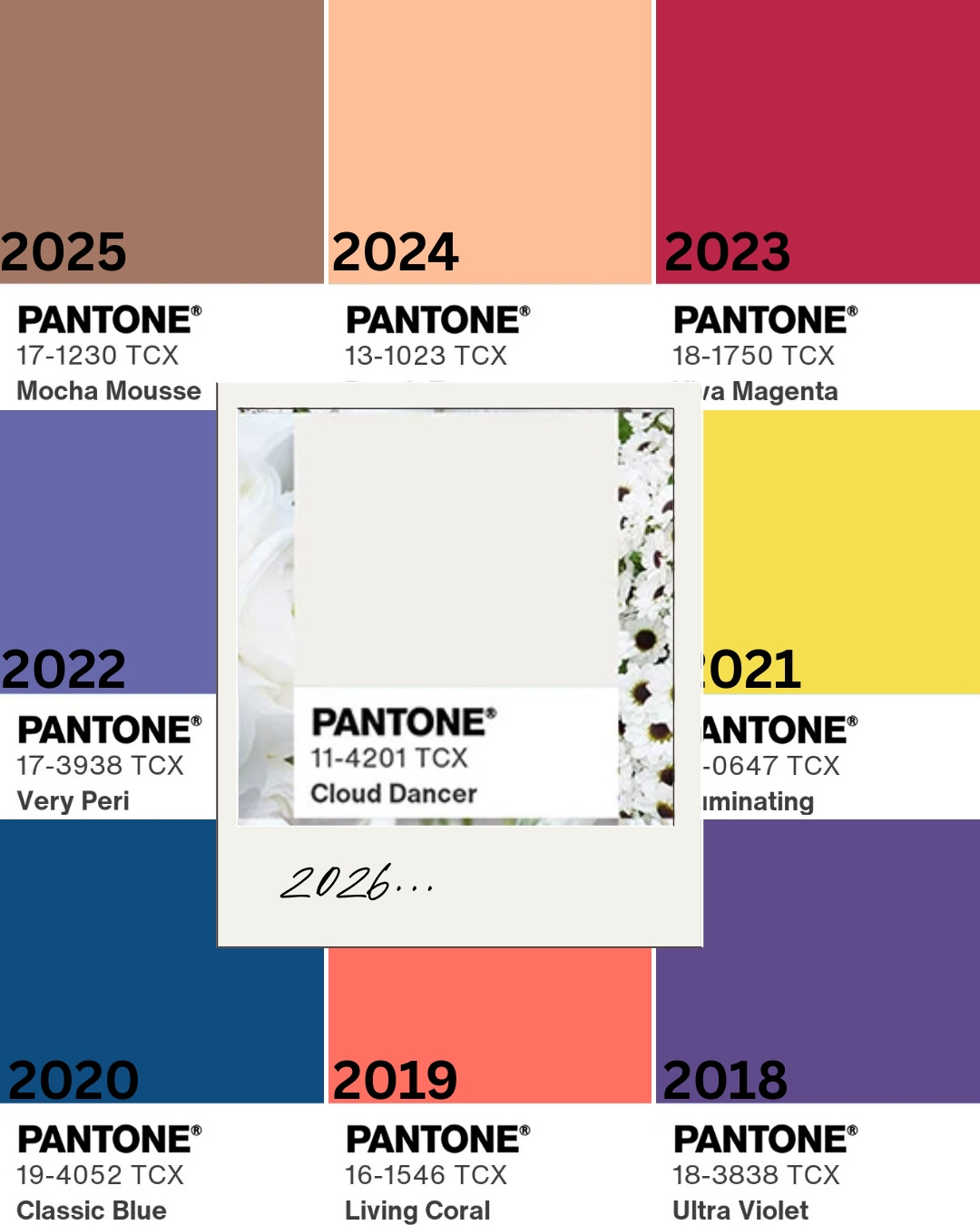
When you line this pick up beside the last eight years of Pantone selections, the difference is glaring. Those colors had emotion, optimism, movement. This one has… absence. Silence.
Many expected 2026 to showcase green. Growth, renewal, momentum… Life.
Instead we got… nothingness.
Pantone calls it “a blank canvas,” which is either a cop-out or a reset button depending on your take. And their description about “calming influence” and “quiet reflection” …reads less insight and more like a college freshman trying to explain why his empty canvas is a bold statement about the state of humanity.
To be fair, we have had a collective obsession with Metal-forward neutrals for years now: white athleisure on all the influencers, white-on-white homes, white SUVs filling every parking lot.
But to crown it Color of the Year? That’s a statement. Whether they meant it or not.
Neutrality may be the aesthetic, but are we unintentionally celebrating emptiness as a lifestyle?
If 2026 is a blank slate where does that leave us? If this is the end of one cycle, Water is next, and Water demands depth, emotion, imagination, and the courage from all of us.
I for one am ready for more depth than this “blank canvas” gives…
xo
Abby
I’m curious… Do you think Pantone missed the mark? Do you love it?! What color do you think actually captures where we’re headed? Drop your pick in the comments.
PS… Each year Pantone collaborates with brands to put out color-of-the-year merch… I find this year’s absolutely ridiculous. Is there anything special about a white sofa? A white running shoe? How about a white post-it note… a WHITE T-SHIRT?! (excuse me, a “Cloud Dancer” version). I feel like I’m taking crazy pills here…


Thanks for sharing this. As a florist who sourced flowers locally, I’m totally disappointed in this choice. Growing white flowers organically and sustainably is very difficult. The Pantone Color of the Year drives wedding flower color palette demands for years to come. Creating all white weddings is a challenge- increased demand will only make it harder. I wrote about how it impacts the local flower world if you’re curious. https://open.substack.com/pub/ellenfrostflowers/p/cloud-dancer?r=9iprc&utm_medium=ios
Thank you for sharing the perspective of this being metal. Priming us for what’s next. That tracks for me. I’m not one bit excited about this color, but honestly most years the color doesn’t do a lot for me. What does crack me up is that I’m pretty much painting my interior this color… as a wait & listen to what arises from this new space.